
The map above is a really common world map. You can find it in almost every school (At least in Indonesia, I don't about other countries). It shows you every details of the globe. Such as, the Oceania, tiny islands in the Pasific Ocean, or the gigantic Russia, or the seemingly edgeless Antarctica, or the largest island in the world, Greenland, that is bigger than ... Austra... whoa wait the minute!!!!
This map is made through cylindrical map projection. Cylindrical projection is basically printing the surface of the earth into the surface of a cylinder, and then the cylinder is cut vertically so that it becomes a rectangle.
 |
| Cylindrical projection is basically like this picture. |
If you observe the first picture in this post, you will see that Australia, the smallest continent, is smaller than Greenland, the largest island. You will also see that Antarctica looks like an gigantic edgeless continent.
 |
| In reality, Greenland is only about a third of Australia. |
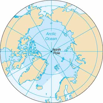
1. Pseudo-cylindrical projection


So, what's the point of this post?
I just want to show you that Greenland is definitely smaller than Australia...
and that the map in your school is lying.
Thank you for reading.
For more information, read this http://www.colorado.edu/geography/gcraft/notes/mapproj/mapproj_f.html
Follow @Globe_Facts too.
P.S. I'm considering to change the twitter's username and create a tumblr account.
No comments:
Post a Comment